
By Annette Brooks
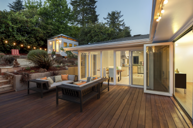
The world of interior design is buzzing with fresh energy, offering colors that reflect optimism, serenity, and a renewed connection to nature. This year, paint trends focus on creating meaningful spaces, providing something for everyone, from soothing neutrals and colors inspired by the natural world to vibrant accents and dramatic hues.
We will dive into the 2025 Colors of the Year from popular paint companies, each brand offering a unique vision. Which hue will you choose to redefine your space and let your walls tell a story?
Glidden: Purple Basil
Purple Basil (PPG1046-7) is a moody violet jewel tone that invites self-expression and creates a sense of mystery. This dramatic shade works beautifully in both modern and traditional spaces, offering depth and sophistication. It pairs well with warm metallic accents like brass or copper and is perfect for accent walls or bold cabinetry. The 2025 Trending Colors feature a curated palette that focuses on creating spaces that feel both expressive and harmonious, balancing boldness with comfort.
Black Magic PPG1001-7: Deep black for striking contrasts.
Stained Glass PPG1165-6: Vibrant blue-green for a pop of color.
Eagle Eye PPG1014-6: Calming blue-gray for serene spaces.
Gray Heron PPG1033-5: Versatile soft gray for neutral elegance.
Brandy Snaps PPG1053-5: Warm brown that adds a cozy touch.


Sherwin-Williams: A Color Capsule
Instead of focusing on a single color, Sherwin-Williams developed a 2025 Color Capsule of the Year featuring nine complementary hues. This expertly edited collection celebrates nine Colors of the Year, providing a versatile blend of hues to suit unique spaces and styles.
White Snow SW 9541: Brilliantly bright white, offering a light and spacious feel.
Clove SW 9605: Deep, warm brown, adding richness and depth.
Malabar SW 9110: Soft, neutral beige, providing a calming backdrop.
Grounded SW 6089: Mid-tone brown that grounds and balances spaces.
Bosc Pear SW 6390: Golden yellow, bringing warmth and energy.
Chartreuse SW 0073: Vibrant yellow-green, adding a pop of color.
Rain Cloud SW 9639: Muted teal with gray notes, offering a sophisticated touch.
Sunbleached SW 9585: Creamy white that softens and brightens interiors.
Mauve Finery SW 6282: Subdued, sophisticated mauve brings botanical beauty and a dreamy quality to spaces, serving as a versatile wall color or accent.

Benjamin Moore: Cinnamon Slate
Cinnamon Slate (2113-40) is a delicate mix of heathered plum and velvety brown. This inviting hue offers enduring style and modern sensibility, bringing a soothing familiarity and balance to any design. The accompanying Color Trends 2025 palette includes:
Sea Salt CSP-95: A soft, muted green that evokes tranquility.
Leather Saddle Brown 2100-20: A rich, deep brown adding warmth and depth.
Chowning’s Tan CW-195: A versatile tan that complements various design elements.
Tissue Pink 1163: Gentle pink offering a subtle touch of color.
Stained Glass CSP-685: Vibrant blue-green that energizes spaces.
Ashwood Moss 1484: Deep, earthy green connecting interiors to nature.
Rosepine 461: Sophisticated, muted red, adding elegance.
Paris Rain 1501: Soft gray with green undertones, perfect for serene settings.
Glacier White OC-37: Crisp, clean white that brightens any room.

Valspar: Encore
Encore (8002-45G) is an atmospheric deep blue, embodying both timeless elegance and modern versatility. Its saturation and subtle violet undertones offer a calming effect and serve as an anchoring shade. Harmonizing colors can be applied to walls, trim, furnishings, and décor, creating a cohesive and elegant aesthetic.
To complement Encore, Valspar recommends pairing it with the following coordinating colors:
Lavender Escape (4002-7B): Soft lavender hue that adds a gentle, calming contrast to Encore’s depth.
Sprig of Sage (8004-28D): Muted sage green, offering an earthy balance to the rich blue tones of Encore.

Behr: Rumors
Rumors (MQ1-15) is a dynamic ruby red that makes a statement and captivates with its vivacity, offering both drama and elegance. The 2025 Trends Palette aligns with the trend towards deep, saturated, earthbound hues favored by leading designers.
Cracked Pepper: Deep, charcoal black, adding sophistication.
Blank Canvas: Warm, inviting white, serving as a versatile backdrop.
Nutmeg Frost: Soft, muted brown offering subtle warmth.
Curious About Color?
Why do certain hues get crowned Color of the Year? Well, it’s not just about fashion — it’s a psychological playground! Each year’s chosen colors are like a mood ring for society. Designers pick these colors based on global trends, cultural shifts, and yes, even economic vibes. It’s meant to reflect our collective psyche, nudge us towards certain feelings like comfort, contentment, energy, and exhilaration, or maybe just make our homes look more Instagrammable. So, if you find yourself painting your walls in this year’s hues, remember, you’re not just decorating — you’re making a subconscious statement.


